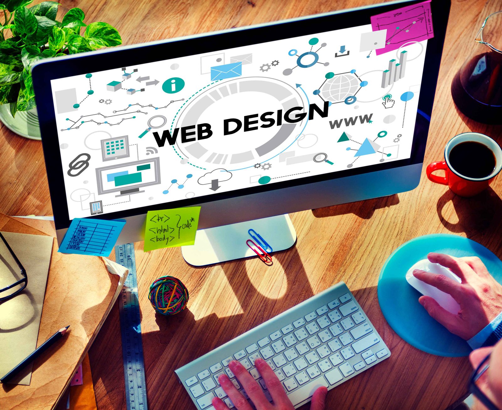
Website Design
You want your website to be perfect.
We are a web development company with a focus on business. We know that when it comes to your website, you want someone who will understand the importance of getting it right. Here are four reasons why you should develop your website with Motherwit:
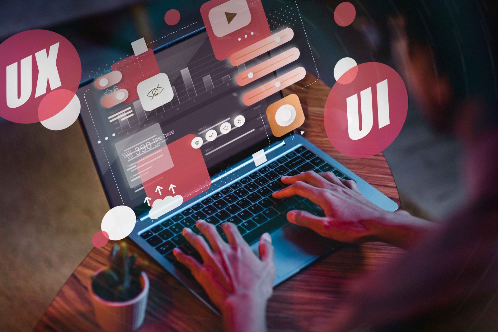
User-friendly Experience
We craft premium designs for agencies and global brands around the globe.
-
A website with a highly-responsive design is one that looks and works great on all devices, from small smartphones to large desktop monitors.
-
A user-friendly experience is one of the key components to a successful website.
-
We focus on delivering a intuitive design that is easy to navigate and provides a consistent user experience across all devices.

SEO-Optimized Pages
We craft responsive design is an approach to web development in which a site is designed to provide an optimal viewing experience
-
Easy reading and navigation with minimal resizing, panning, and scrolling—across a wide range of devices, including desktop computer monitors and mobiles.
-
When someone visits your site on a mobile device, they will automatically be redirected to the mobile version.
-
You may perform a variety of things to make your website search engine-friendly.
Website Design
We take the time to get to know your business and understand your specific needs.
-
Motherwit specializes in developing custom websites for small businesses.
-
We are not a one-size-fits-all website development company.
-
We also offer ongoing support and maintenance so you can be confident your website will continue to meet your needs as your business grows.
